Introduction
Visual Communication Principles are of utmost importance in the enormous and clamorous online world where gaining attention and retention is a constant challenge. It is not enough to possess great content or a groundbreaking product; without a clear strategy, your message will be drowned in the sea of digital noise. It is in this case that mastering Visual Communication Principles becomes the greatest tool in your arsenal. These form the very rules and regulations under which visual elements are organized and comprehended, directly impacting user interaction, understanding, and the overall experience.
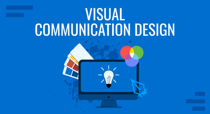
What is Visual Communication?
Visual communication is essentially the art of expressing ideas, information, and emotions with the use of visual elements. This includes all the images, typography, colors as well as layouts, icons, and animations. In online communication, successful visual communication will focus on:
- Attract Attention: Attract the user to important information at first sight.
- Deliver Knowledge in a User-Friendly Way: Simplify the more complicated concepts.
- Guide User Flow: Lead users on a course of their desire, e.g. buying something or a content consumption experience.
- Elicit Emotion: This is the capacity to evoke a certain feeling or atmosphere that is consistent with the brand.
- Create Trust and Credibility: Professional interface is an indication of professionalism of the brand itself.
These goals are met through an artful manipulation of a combination of universal principles of design that determine the natural way a human being processes visual data.
Principles of Visual Communication Core in User Interaction
Designers need to capitalize on a number of principles to actually engage the users. These are not just rules of aesthetic guides, but these are psychological instruments that formulate perceptions and conduct.
Read more:
10 key principles of visual communication in design
Hierarchy: Guiding the Eye
The most important user engagement principle is probably visual hierarchy. It involves the organization of things in a manner that implies their relative significance. A digital interface works in the same way that an article does, which presents the user with visual cues to inform them of what they need to look at the first, second, etc.
- The Principles: Bigger elements, bolder fonts, brighter colors, and positioning in the center always attract more attention. On the other hand, less eminent or less big or light things are seen as secondary.
- Effects on Engagement: An obvious hierarchy minimizes cognitive capacity and helps users to scan and find the important information in a short period of time. It is essential without making a page overwhelming and causing confusion and disengagement.
- Example: A product page on an e-commerce site would often have its product image and the Add to Cart button as the most visually prominent followed then by a price, the name of the product and then the product description or reviews.
Contrast: Making Elements Visible
Contrast is used to mean difference amongst two or more items in a design. It is what makes one aspect to stand out among the rest and aid in creating a hierarchy.
- How it Works: Contrast may be accomplished by differences in:
- Color: Light text in a dark background, or a bright call-to-action button on a subdued background.
- Size: A big headline with smaller body texts.
- Form: An iconic round shape on a square background is found.
- Background: A smooth background with a textured image in the background.
- Space: There is ample white space in between an important element.
- Effects on Engagement: Contrasts enhance the readability, make the interactive aspects more explorable, and assists in breaking up content, avoiding monotony of the visual content. Lack of contrast particularly in text causes eye strain and frustration.
- Example: The bright contrasting Buy Now button allows the button to stand out and, more importantly, it is easily clicked, which increases conversions.
Stasis: Finding Stability and Equilibrium
Balance in design is defined as the proportions of visual weight in a layout. Similarly to the physical objects that have a weight; the visual objects are perceived to have weight depending on their size, colour and position.
How Visual Communication Works
- Symmetrical Balance: The balance is made by the even distribution of the elements around the central axis which gives a formal, stable and often traditional feel.
- Asymmetrical Balance: The components are not the same on both sides of an axis but are organized in a way that brings about the equal weight of the visuals. This can be more dynamic and contemporary.
- Influence on Engagement:A balanced layout is stable, ordered and attractive to look at and therefore is comfortable to the users to work with. The unbalanced design may be disoriented, chaotic, and amateurish.
- Examples: A design of a web site where there is a large hero image in 1 side and the smaller block of text and a call to action in the other side balance the visual weight and provide an interesting and dynamic presentation.
Congruency: Accuracy and Direction
- Alignment: The concept of aligning the elements by placing the edges (or centres) into line. It gives an impression that there is order, neatness, and visual interaction between things.
- Usage: It is possible to organize elements horizontally (left, center, right) or vertically (top, middle, bottom). A grid system becomes essential in the alignment issue.
- Influence on Engagement: Engaging factors are simpler to scan and process. Professional and credible design appears well aligned, which in contrast to sloppy and amateurish design with misaligned elements makes a design not credible.
- Case in point: Left alignment of body text, images, and form items should be used consistently on a web page, which makes the page have a neat, well-organized flow that the user is easy to navigate.
Repetition: Strengthening Identity and Cohesion
Repetition can be defined as the application of the same visual materials (colors, fonts, shapes, patterns) in a design to achieve the consistency and reinforcement of the general message.
- Article of Operation: When repeated, these elements will be familiar patterns that strengthen branding and direct expectations of the user.
- Effects on Interaction: Repetition can be used to create a steady brand name, and thus the interface will seem unified and customary. It is also more usable as it trains users to be aware of interactive elements or content types. Examples are consistent navigation elements or the same design of buttons on other pages.
- Illustration: It makes sense to use the same brand color on all primary call-to-action buttons in the entire webpage to support its purpose and the brand name.
Proximity: Clustering of Like Elements
The idea of proximity dictates that items that are displayed next to each other are seen in relation or as part of the same category.
- Mechanism: putting similar items together visually separates them and thematically unrelated items to make the information easier to digest.
- Engagement Effect: Making good use of proximity minimizes clutter and enhances readability. The relationships between bits of information can be immediately comprehended by the users, which saves cognitive effort and makes the interface look more intuitive.
- Example: An e-commerce site will usually put a product image, its name, price and a brief description in a close proximity thus clearly showing that they are all about the same product.
Typography Visual Voice of Text
Though typography is the art of organizing type, its practical characteristics font choice, size, weight, line height, letter spacing are a great means of communication.
- Principles: The fonts used in different fonts can be used in different feelings (e.g., the serif font to use in the traditional credibility and a sans-serif font to be used in the modern clarity). Hierarchy is determined by size and weight. Line space and height influence legibility.
- Influence on Engagement: Typography is the most useful tool that can be chosen and positioned correctly to increase the readability and the beauty of the content, set it friendly but not overwhelming. Bad typography may result in eye strain and missed content by the users.
- Example: Headlines should be bold and distinct font, body text should use a much readable and slightly smaller font, as this will guarantee both impact and continued interest.
Incorporation of Principles of Holistic Engagement
These values do not work separately, and rather they are mutually supportive. Internet design is a successful technique that combines them to form a cohesive, enjoyable experience. For instance:
- Hierarchy is sometimes made with contrast (e.g. an oversized, bold headline with smaller, lighter body text).
- Alignment helps create balance and proximity where one can see similar items together in apparently an organized manner.
- The repetition of typography and color schemes supports the brand and usability.
When considered carefully, such principles form a well-integrated visual language, which is not only appealing but also informative, instructive and pleasing to the user. The result is an increase in the average length of visit, conversion, and a more powerful and memorable brand- all of which are essential in the digital market.
Crea8ive Solutions
Conclusion
The principles of visual communication in the competitive online world are not just design principles, but strategic principles that are enforced to engage users. Using careful hierarchy, contrast, balance, alignment, repetition, proximity, judicious typography, designers can create interfaces that are easy to use, beautiful, and very effective in the delivery of the message required.
Frequently Asked Questions (FAQs)
1. Why is visual hierarchy important for user engagement?
Visual hierarchy acts as a map for the user’s eyes. By using size, color, and placement to highlight the most important information first, you reduce “cognitive load”—meaning users don’t have to work hard to understand what to do next. This leads to a smoother experience and higher conversion rates.
2. How does whitespace (negative space) affect visual communication?
Whitespace is just as important as the content itself. It prevents a design from looking cluttered, helps define proximity between elements, and gives the user’s eyes a place to rest. Proper use of whitespace makes your call-to-action buttons stand out and improves overall readability.
3. What is the “Gestalt Principle” in digital design?
Gestalt principles are psychological rules that describe how humans naturally organize visual elements into groups or unified wholes. Principles like Proximity (grouping close items) and Similarity (grouping items that look alike) help designers create interfaces that feel intuitive and “organized” to the human brain.
4. Can poor typography really drive users away?
Yes. Typography is the “voice” of your text. If a font is too small, has poor contrast, or lacks enough line spacing, users will feel physical eye strain. Most users will abandon a website within seconds if the text is difficult to scan or read, regardless of how good the actual content is.
5. How do I balance aesthetics with functionality?
A truly engaging design follows the rule of “form follows function.” While beauty attracts users, usability keeps them. You achieve balance by ensuring that decorative elements don’t distract from navigation and that every visual choice—like a specific color or animation—serves a purpose in guiding the user toward a goal.